Overview

Vancpharm has been producing around 40 different products currently available through a physician’s prescription. With new over the counter (OTC) products, Vancpharm is entering the Canadian market and competing directly for the consumer’s attention on shelves at stores like London Drugs, Shoppers Drug Mart, and Costco, as well as online. To successfully launch their new products, they needed a pharma brand strategy to ensure their new products are apart of a cohesive go-to-market campaign.

They didn’t have an existing brand in place, which meant coming up with a fresh design that would stand up to competitors and major brands that have accrued brand equity over the years. This branding was going to work with other marketing campaigns during the product launch to create a cohesive and memorable public look for Vancpharm across Canada.

34%

increase in sales in 1 month

55%

increase in distribution at retail stores across Canada

Challenge

To match up to its competitors, Vancpharm needed a pharma brand strategy to tell the corporate story and brand for all 4 products. The main objective was for Vancpharm to become the leader in the generic pharmaceutical prescription manufacturer in Western Canada.

  • How to increase brand equity through the launch of four products?
  • How do we implement a design strategy to appeal to customers and increase sales?
  • How will this pharma brand strategy stand the test of time while also being unique and memorable?

Solution

Product Naming and Pharma Brand Strategy

Pace Creative helped Vancpharm develop a branding strategy that would measure up against other major brands for consumer engagement.

For each product, we aimed to:

  • Explain the health benefit better than the competition.
  • Emphasize consumer demand trends (i.e. organic, intolerances).
  • Better visualize the product at the point of sale (i.e. the medium).
  • Differentiate the product from competitors and stand out on the shelf.
  • Promote offers for a trial period.

Packaging Design Strategy

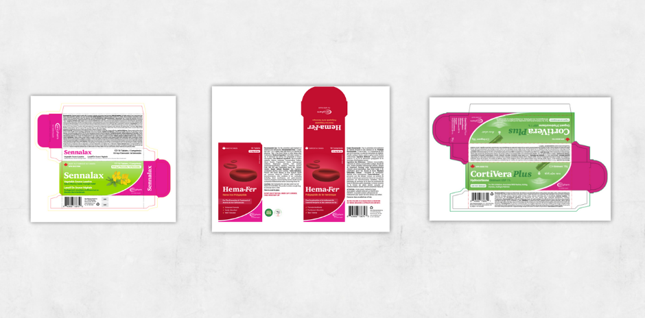
Each product’s label and packaging would communicate the personality, beliefs, and values of its offerings. The packaging serves as a tool of differentiation aiding the consumer’s choice within a range of similar products.

We would aim to be consistent across packaging designs to build consistency and brand equity. Vancpharm would go for a modern look that showcased their product as a superior technical alternative whilst emphasizing the natural qualities of the product.

Customer-Centric Content

When developing the brand, which prides itself on products that combine nature and science, we wanted to ensure it appealed to the different consumer types. This is an exciting area of opportunity when it comes to positioning. The natural aspect would appeal to parents who want to purchase gentle products for their children, as well as those who practice Lifestyles of Health and Sustainability (LOHAS). While baby boomers may have a preferred brand already, there tends to be a lack of loyalty in the category, and they are always seeking out the latest health information backed by scientific research.

Understanding how to attract the attention of different consumers would benefit Vancpharm in standing out from its competitors.

Result

  • Pedia-Safe, Hema-Fer, Sennalax, and CortiVerra launched and were to be sold at private pharmacies, natural stores, Whole Foods, and retail stores.
  • The launch of Hema-Fer and Cortiverra were well-received in the market by both consumers and pharmacists.
  • The four products would be launched across several Canadian provinces, increasing the number of people reached.
  • This pharma brand strategy measures up to other brands on the shelves and improves the company’s brand awareness by educating consumers about their products.

Explore more of our work